Romanek Design Studio

Explore the Collection >

Discover 4 Eclecticism Projects by Romanek Design Studio

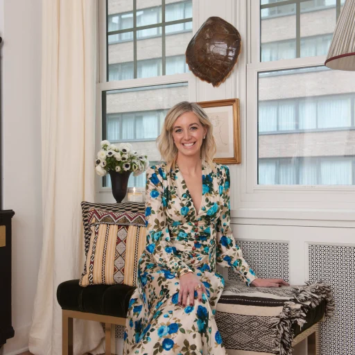
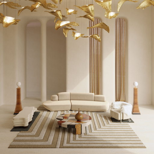
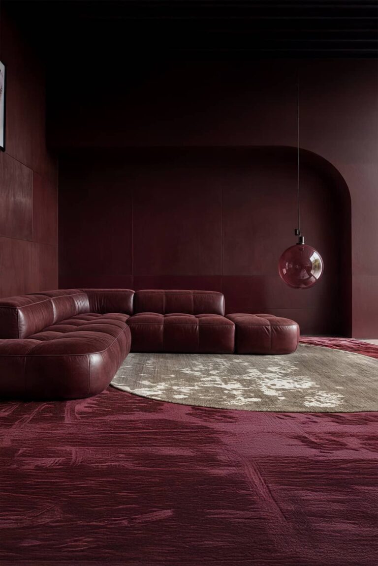
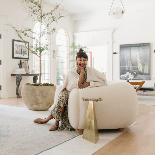
“Elegant eclecticism with a dash of playfulness and something unexpected” is the motto of Romanek Design Studio.  Brigette Romanek, an incredibly talented self-taught designer, created Romanek Design Studio while assisting her friend Kelly Sawyer Patricof with the interior design of her Miami house. These days, Brigette Romanek, a gorgeous and talented interior designer, has built the most exquisite homes for influential people in the entertainment industry through her company, Romanek Design Studio. Her Studio provides an “eclecticism” perspective to the field of furniture design in addition to residential projects. Laurel Canyon Romanek Design Studio’s ecleticism concept while coming up with this gorgeous design was “when you have a house with history work with it, it’s fun.” the architect of Laurel Canyon chose to embrace the unusual features of the home rather than change or remove them. And rich with “tales to tell” and history. This wonderful family home is situated in Los Angeles, which is well-known for its beaches, sunsets, and the myriad of colors that the sky is “painted” with. She sought to add it because Romanek Design Studio clients frequently return at dusk. That served as one of the sources of inspiration for this eclectic design. Combining this old home with contemporary furniture creates a stunning, timeless home, as shown in the expansive living area with natural elements visible above. Being filled with so many vibrant hues makes the space appear lighter. Romanek Design Studio carefully considers creating a fresh atmosphere in the room; the small tree and other plants facilitate it. In the dining room, you can see some of the antiques the interior designer included in the design scheme on the walls. This family home commonly employs the eclecticism design trend. The sustainable dining table, bench set, and leather seating in this spacious space strike the mid-century modern ideal balance. The modern library is located above and features a reading area in the middle of the room with a brown sofa, two blue armchairs, a trio of benches with various shapes, and a single center table—an eclectic space for eclectic knowledge. In one of the interviews conducted with Brigette Romanek regarding this creation, she stated that when designing, she considers her clients’ happiness, joy upon returning home, and ability to spend time in all the rooms comfortably. “Let your personality shine through,” creating a distinct atmosphere there. Every home design incorporates the designer’s personality, and this one is yet another that does it in a vibrant, amiable way. But, as Romanek noted, “For clients, you have to learn to express their quiet,” it is far more crucial to understand the client’s personality in the environment. You must!” for the design development to satisfy them by encompassing all the elements that might become a part of their client’s lives.  In the images above, the Garden and the floral entrance have a powerful element, making them very new spaces of the house. The hallway includes two central tables with an enormous eye-catching flower branch, bright natural light, and a marble floor. Under the wooden pine staircase is a little sitting area. The Garden offers a dining area, which can be a cozy and pleasant place just to eat. Isle Isle is one interior design in California where we once more see the eclectic projection, with a lot of natural light entering this magnificent family home. Romanek Design Studio used several components from the previous creation in this one. As seen in the images below,  There are a few different seating spaces in this living room, but the one to your right has just a large sofa, a hammock lounger, and a little triangle center table. This site is distinguished by the white, gray, and wood tones which creates an eclectic concept. On the left, a room with various hues can be seen, including a leather tone with a Hermés blanket, a side table with some flowers, a rectangular center table, and a wood recliner. Two rugs, one of which Romanek Design Studio chose to place precisely in the area of the wood armchair, and the larger, deep blue rug connect all the elements in this side of the room. This dining room has distinguishing eclecticism features, the different shapes and colors of the chairs, the material of the round table, and the exciting art portrait around the house. It is noticeable from the items on the table’s top, the flowers and limes, and the vast window that looks out onto the Garden and floods the room with light that the author’s individuality can be seen in this fresh and modern eclecticism. In this sitting room, where Brown is the protagonist, being in all of the wood walls and the big rug that connects the white of the armchairs and the center table altogether. Near the windows is a rose-red armchair surrounded by the two large windows of the room. A timeless design with an eclectic concept that combines the new with the old, and as the founder Romanek once said, “Make it Fun!” The green smoke room is where nature lives inside the furniture, which Romanek Design Studio chooses to display in a relaxed and warm way. The Bu The Bu house is made elegantly by Romanek Design Studio while still providing a sense of familiarity. This stunning home is located in Los Angeles. “The Bu” is a nickname that stands for Malibu; “it’s a home for a 40-something man, with a darling little son who runs about the yard.” Perhaps for this reason, she explains, her client asked for a “home that was quiet and serene, but not bashful.” The Simple yet gorgeous dining room, minimalist design, and monochrome color scheme with crisp lines and accent colors characterize this space. Behind the scenes of the dining area is a minimalist kitchen made of wood. Still on the first floor, as we can see in the pictures above, the rug’s distinctive color and texture make it earthy in the living area, which also contains a leather-suspended chair …

Read more

Sasha Adler Design

Explore the Collection >

Sasha Adler Design Projects : The Beauty Of Mix Old And New

Let’s get to know Sasha Adler Design’s projects and understand how he works with the space’s architecture to create a balanced dialogue of modern elements, a collection of vintage pieces and custom design items. Sasha Adler Design is an interior design company specializing in restoring historic properties, but it also works on building from scratch. He is concerned with knowing his project, and that is how he commits himself to start a project. It treats the initial phase of each project as knowing the client and talking to him about how he would like the space to work. After obtaining this information, they build a narrative around the interior by carefully selecting architectural details, natural materials and custom designs. It agrees on its process to meet each client’s objectives, schedule and budget. In addition, he also focuses on creating a space that is attentive, comfortable and unique. Projects Let’s analyze some of Sasha Adler Design’s projects, in which we can understand how she works and expresses her inspirations in her works. We will be able to understand the old-fashioned style in his projects, in a combination of vintage pieces with a more contemporary atmosphere. Chicago Residence Let’s start in Chicago, in a residence on the near north side, where we have our first contact with the unique style of Sasha Adler Design. What comes first is the choice of colors used in this place, green being the choice in one of the prominent places in the house, the dining room. We can see the presence of green, even if in different tones, both on the wall and in some furniture items, such as the chairs. In the rest of the house, we see space where the designer prefers to keep the simplicity of white, in the living room and bedroom, or the boldness of other different colors, such as the intense blue, in another living room that this house presents. Considering what we mentioned earlier, Sasha Adler Design likes to play between the search for the archaic and the discovery of the modern. In this specific project, this game of styles is associated with finishing some decorative items and furniture pieces with older and more primitive lines. Combining all the styles worked on in this project, we also have an apex of maximalist tendency in this space. In some items, we have details of eccentricity and exaggeration, and we also have an overdose of details in the environment. Sasha Adler Design takes advantage of each location to add a point that brings something more to the environment. Combining all the styles worked on in this project, we also have an apex of maximalist tendency in this space. Chicago Family Home Let’s continue in Chicago and move on to a family home project. In this, several of the styles we explored earlier are present again, as we will see. However, it is a project with particularities about the previous one. Starting with the choice of colors, we have a color that dominates almost the entire house, blue. Color dominates nearly all spaces, from the living room to the bathroom. Only in some divisions the color blue is absent, and it is another color that takes over the place, as is the example of the office, in tons of wood, and the dining room, in tons of white. In this project, we see again the intention to use old-fashioned items. We can see this very present in decorative items, such as the bathroom, which has a mirror and a faucet with rustic finishes. We can also see lamps throughout the house that refer to this antique style. However, we were able to perceive the contrast that Sasha Adler Design works between the old vs the modern, with elements that refer to this contemporary style. We can see this in some spaces of this project where a minimalist style can be identified, with the absence of exaggerated details. In this game of styles, despite the contrast, the designer still manages to bring harmony and make this space pleasant and charming. Even so, all this minimalist tendency that we can find in some spaces is not the main style of this project. As seen earlier in the Sasha Adler Design project, maximalism is worked on in practically all environments. The concern to convey meanings to the house’s rooms is very present, from the presence of bolder wallpaper or more eccentric pieces of furniture or decoration. Little throughout the place, we can see the use of all the space to create an essence around the area. Beverly Hills Let’s move now to the last project that we will analyze from Sasha Adler Design, located in Beverly Hills. In this one, we will see a project very different from the other two that we presented earlier, in which the archaic aspect is set aside, and the presence of these old-fashioned elements is not found in the environment. In this project, the contemporary style is very present throughout the space. Open, simple areas, lots of natural light, and large windows, these are some of the main features that stand out at first glance when looking at this project by Sasha Adler Design. Serene and calming colors are in the essence of this place, with the white and brown of the wood as the basis of the environment. The designer tries not to explore too many different colors, only colors other than those mentioned are present in some decoration details, such as rugs. In addition to all the features listed above, the modern style extends even further to the minimalist trend in this project by Sasha Adler Design. We can see spaces where the elements are linear and harmonious with the rest of the area in the environment, these elements being little responsible for carrying meaning to these same places. The exterior location is a perfect example of this, where we can see that the designer’s concern was to display tranquility and well-being without excessive elements. We …

Read more

Explore the Collection >

The Best of Ultra-Modern Designs by Top Interior Designer Nicole Hollis

Nicole Hollis is recognized for creating timeless interiors that lift the human spirit. Be inspired by projects that make this AD 100 list professional an expert in good taste and luxury design. This will certainly not be the first time that the interior designer’s name will appear here. Member of the select list of AD 100 2023, the professional brings awards and admirers for the quality and innovation of her projects. Check out more details about some of her latest work below! The Irreverent Design Style of Nicole Hollis Nicole Hollis is a renowned interior designer who has made a name for herself with her unique approach to interior design. Based in San Francisco, California, her Studio has worked on a wide range of projects, from residential to hospitality, and her portfolio showcases her ability to seamlessly blend different styles, textures, and colors to create a cohesive and inspiring look. In fact, the designer is known for creating timeless, elegant interiors that uplift the human spirit. Her style is best described as “boldly spare,” with a focus on form, light, and shadow, and her work may incorporate elements of minimalism – but it is never rigid! Instead, Hollis creates ultra-modern designs that are warm, welcoming, and inviting. The Balance Between Modern and Dramatic Elements One of Hollis’ key design principles is to use custom-made accents that reflect the spirit of collaboration. This means that she works closely with her clients to create spaces that are tailored to their needs and preferences. As a good lover of color and ultra-modern designs, she is also not afraid to experiment with different textures and finishes –  creating spaces that are both visually stunning and tactile. Thus, one of the main characteristics of Nicole Hollis’ design style is her use of neutral colors, such as white, beige, and gray. This allows more dramatic elements, such as bold artwork or statement furniture pieces, to stand out and create a sense of balance and harmony within the space. A real delight for the eyes! It also draws inspiration from the local culture and atmosphere, incorporating elements of the local landscape, art and surrounding architecture to create an authentic connection between the space and its surroundings. AD100 Ultra-Modern Designs Projects: Below are some impressive examples of modern interior design done by Nicole Hollis. Her ability to create elegant and functional spaces that reflect her clients’ individuality is what sets her apart from others in the field. Her use of natural materials, muted color palettes, and minimalist design elements create spaces that are timeless and sophisticated. Haight-Ashbury, CA Nicole Hollis’s design for a Haight-Ashbury residence in San Francisco is an excellent example of how she combines modernity with a touch of traditionalism. The project involved a complete overhaul of the home’s interior spaces, including the kitchen, living area, and bedrooms. The result is a space that is chic, refined, and luxurious. This is another example of ultra-modern design projects designed by Nicole Hollis. The mansion is full of colors, rock references, and Morocco vibes, and it is a testament to Hollis’s ability to create homes that reflect her clients’ maximalist personalities and desires. The project was a challenging one for the designer, as she had to step out of her comfort zone and create a home that could fulfill her client’s dreams. The kitchen, for example, features a minimalist design with sleek cabinetry, white marble countertops, and a black range hood. The living area, on the other hand, boasts a warm and inviting atmosphere, thanks to the use of natural materials like wood and stone. The bedrooms are equally stunning, with plush bedding, custom lighting, and art pieces that add to the ambiance. Presidio Heights, CA Another one of Hollis’s projects in San Francisco is a Presidio Heights home that underwent a complete renovation. The result is an ultra-modern space that is both sophisticated and functional. The design features a mix of textures and materials, such as leather, wood, and steel, that create a balanced and refined atmosphere. The living room, for example, features a custom leather sofa and chairs, a walnut coffee table, and an oversized rug that adds a touch of warmth. The kitchen is equally impressive, with a sleek design that features white cabinetry, stainless steel appliances, and a marble countertop. The dining area is also worth noting, with a custom-designed table that can seat up to ten people. Russian Hill Townhouse, CA Hollis’s design for a Russian Hill townhouse in San Francisco is a masterclass in ultra-modern designs. The space features a minimalist aesthetic with a muted color palette that creates a serene and peaceful atmosphere. The design incorporates natural materials like wood and stone to add warmth and texture to the space. The living area is a perfect example of how Hollis creates a functional yet elegant space. The room features a custom-built sectional sofa, a wool rug, and a sleek coffee table. The bedroom is equally stunning, with custom bedding and a plush headboard that adds a touch of luxury to the space. Sausalito, CA Lastly, the project design by Nicole Hollis for a Sausalito home is a showcase of her ability to create a harmonious relationship between the interior and exterior spaces. The design features floor-to-ceiling windows that offer stunning views of the San Francisco Bay, while also allowing natural light to flood the space. The living area is designed to maximize the views, with a minimalist design that features a custom sectional sofa, a low coffee table, and an oversized area rug. The kitchen is equally impressive, with sleek white cabinetry, a marble countertop, and stainless steel appliances. The bedroom features a custom-designed bed, an oversized headboard, and a neutral color palette that creates a calming atmosphere. We hope you enjoyed the talent of this interior designer who has a unique approach to ultra-modern designs. Her style is boldly spare, with a focus on form, light and shadow. Take the opportunity to also learn about other spaces as warm, …

Read more

Rafael De Cardenas

Explore the Collection >

Get To Know Rafael De Cardenas’s Top 4 Interior Designs

Nothing is off-limits to Rafael De Cardenas. In these four designs that will be explored, we’ll see the breathtaking masterpieces in each interior design. Despite changing his career path from Calvin Klein Menswear to interior design, Rafael de Cardenas considers designing his life. He started his own company in 2006 after completing his architectural studies at UCLA. Begin to establish a reputation for producing atmospheric spaces, whether for domestic use or even as ice-expedition yachts. Rafael de Cardenas Ltd. has maintained a small, devoted crew with varied backgrounds, including dance, science research, and fashion design. The company initially operated out of a small office in Chinatown in New York City; as of now, they have two offices and one in London. We are developing projects throughout Eastern and Western Europe, North America, and Asia. Olympic Tower Residence In this high-rise apartment in Manhattan, there are three different living areas. The lounge, study, and private chambers are all designed to frame and enhance the view of Manhattan’s skyline. We can picture how the delicate surfaces in each area of this residence prevent the need for numerous extra furnishings. A neutral color scheme allows subtle hue, texture, and reflection variations. Rafael de Cardenas decided on a minimalistic aesthetic. It implies that every piece of furniture, color, and texture serves a purpose and enhances the room rather than simply maintaining a basic aesthetic or appealing architectural element. Open floor layouts, abundant natural light, and well-built, comfortable furniture with simple lines are typical features of the rooms. Examining this apartment’s interior features, we can observe that the art aspects are the most engaging and that there was just one rug added in the living room to connect the many pieces. Yet, they offer the spaces a clever and imaginative quality that reflects the individualist of the designer’s preferences. This Rafael de Cardenas interior design’s end effect is stunning. Glebe Place Residence This English mansion, located on Brompton Road, which has five bedrooms, was completely refurbished to evoke a timeless luxury while mixing modern classics with the property’s historic essence. Rafael de Cárdenas decided to give this interior design a strong “sound.” The furniture in daring colors with some neutral and vivid accessories adds a touch of sophistication and a sense of history. Each location contains a historical past just waiting to be seen and felt, much like narrating a story. As we can see in the different rooms in the images above, the light is a primary factor in this design; every room has its natural light, and the materials used are highlighted for that light. This mansion even has a garden, which Philip Nixon, a landscape architect, helped create, which has a reflecting pool with a cantilevered slate seat, a green wall, and palm fronds around a checkerboard terrace. West Eleventh Street Residence The Greenwich Lane, a project that has been in the works for more than ten years, consists of five neighboring townhouses and an entire block of structures between 11th and 12th Streets in the exclusive West Village. Each of the buildings has an underground connection to a variety of amenities, including a fully staffed gym, an Olympic-sized swimming pool, a screening room, a kids’ play area, and more. The vertical chromatic temperature gradient is the foundation for the entire five-story house’s architecture. The living area on the second level has a clear view of the courtyard at Greenwich Lane. With floor-to-ceiling windows, a custom daybed by de Cárdenas makes the most of the space. The split rocker vase by Jeff Koons is the focal point of the unique coffee table. On the opposite corner, a Campana Brothers chair and an old Stilnovo light are also present. Another living area with interior design on the left features an excellent assortment of artwork chosen by the designer and his team from DeWoody’s collection. Most of the upholstered items throughout are custom created and covered in Maharam fabric, including the sofa. Bright hues are especially noticeable in the interior decor on the right. A perfect illustration of de Rafael de Cardenas’s eclectic, occasionally edgy aesthetic is the dining room. Bright hues are especially noticeable in the interior decor on the right. Claude Missir’s Sticks dining table, Charlotte Perriand’s chairs, a Cherry Bomb chandelier by Lindsey Adelman, and Block containers from Apparatus embellish the table. The Sticks dining table was purchased from Nilufar. The blue room, two Pierre Paulin Pacha chairs from Demisch Danant that punctuate the space with their rose boucle, and the beautiful marble bath with surfaces chosen by O’Brien are some of these interior design, by Rafael de Cardenas, that strikes the eye. The earth tones on the first floor provide a cool atmosphere. De Cárdenas selected a custom-designed organic ash table, seats by Konstantin Grcic, and bar stools by Thomas Hayes for the kitchen, which also features dark wood cabinetry. The private garden can be seen from the kitchen. The area is connected to the community courtyard of the property beyond the brick wall; the FXFOWLE master plan offers a private enclave where residents may access almost all services without leaving the house. New Canaan Residence Just as any other stylish interior design project above, this one is also a dazzling eclectic design style, a work of architecture with a rich atmospheric nuance. We can see how the natural light that comes in transforms this living area into a quite lovely and tranquil space. With its various shades of blue, the rug used draws more attention thanks to the furnishings’ bright colors. The center table is where all the seating furniture is turned. The presence of plants opens up the space slightly and makes the room loves fresh. Most of the blue hues in the house are brought in by a rug. The blue carpeting and armchair in this sitting space go well with the bronze center table and sofa. Beyond the seating area, the two statues in different genres provide the impression of a “meaningful room.” This hallway’s vibrant …

Read more

Explore the Collection >

Look Into Studio Thomas James And Its Distinctive And Astonishing Style

Let’s browse through some of Studio Thomas James’ projects and explore how the studio works with its unusual and distinctive style. Located in downtown Dallas, Texas, Studio Thomas James is committed to building a portfolio of projects rich in expression and meaning. With the founder and lead interior designer, Philip Thomas Vanderford, Studio Thomas James agrees with the creation of unique spaces, as stated by “No two spaces designed by Studio Thomas James are ever alike,” where they try to ensure that each project reflects the ideals and styles for each specific owner. “Classic yet innovative, playful yet refined.” is another way the studio characterizes its work, which has already expanded worldwide, from Paris, California, India and Shanghai. Some projects With a particular style, Studio Thomas James ‘ projects feature a combination of colors and references very different from what we are used to seeing. In this way, we will present some of the projects this studio offers us. The Bold On Beverly For the first project, we will present The Bold On Beverly, a project that is already starting to highlight some of the core characteristics of Studio Thomas James. We began to notice the maximalist tendency in his projects, with the presence of several different colors that always have strong and striking tones. Many geometric references are also present in this space, as we can see in the tile on the floor under the stairs. These geometric references are also found in paintings, cushions, and even sofas or rugs. We can see the color white as the color that reigns in this space, however, what stands out is the yellow and blue highlighted in the present furniture. This highlight is because the colors are very strong, as we mentioned earlier. Yellow is present in the curtains and some items’ gold, while blue is seen in the sofas. The space focuses on these three colors, where the appearance of other colors only occurs in the details of the paintings, cushions, or occasional decorative items. Details are very well explored in this project, which aligns with the maximalist tendency present in the style of Studio Thomas James. However, in this specific project, we can see a genre of maximalism vs minimalism explored, with the presence of areas where the maximalist style is clearly identified and others where the minimalist style is what is most associated. We were able to identify areas where the studio even works on details on the ceiling and others where the absence of details is revealed. This magnificent home also has luxury touches, as seen in the bathroom. We can see that Studio Thomas James intended to create a place that, by playing with the maximalism vs minimalism that we talked about earlier, is of refinement and an admirable presentation. The Dallas Housewife If in the last project we saw one in which the maximalist tendency had to share the protagonism with the minimalist, in The Dallas Housewife, the maximalist style takes over the whole house. In this project, details and illustrations are intensely present, and the dining room is the perfect example of this, from the wallpaper to the chairs surrounding the dining table. As the project’s name indicates, this house has many female references. Starting with the colors, pink is very present throughout all the rooms in the house, both on the walls, on the sofas and in other furniture and decorative elements. We still have the illustration of female figures in some paintings in the house. In this way, we can understand how Studio Thomas James works on a theme and a specific context, molding the entire house and its respective furniture to that theme. Once again, in addition to the style employed by Studio Thomas James, they make this space a space of brightness and refinement. Just as the style used becomes a reference for the studio, this desire for luxury and elegance is also beginning to be associated with the projects. The Arrival We now move on to a project that already distinguishes itself from the previous ones. Unlike the last two, this one already escapes the eccentricity that the others presented, and this is immediately visible from the color scheme. The colors used are more serene and neutral, and it is rare for a color to appear out of context, with the whole space in harmony and agreement. However, some elements with extravagant colors still appear in decorative items, as we can see in the living room. In this project, it is also worth highlighting how Studio Thomas James worked on the use of natural light with large windows in all rooms of the house. Throughout the house, we have a basic concept of how each environment is built, always with the same formula for idealizing the space. Only in the office can we see a departure from the standard of this project, with a darker and more closed environment, which can be explained by being a space of concentration and less relaxation. The Upgrade Bearing in mind that in the last project we saw one that deviated from the most characteristic features of Studio Thomas James, in this one we returned to the most commonplace and to the genre that the studio is characterized by. We are again aware of the usual eccentricity and the play of colors usually found in the studio’s projects, as well as the desire for luxury spaces. Like all the features listed above, the maximalist style is also present in this project, another one of the standards of Studio Thomas James. We can see this trend both in the dining room and in the study room, in which the studio aims to give the maximum detail to the space, as we can immediately see from the wallpaper used in both places, which are exotic and extravagant. Despite all the details and styles explored by Studio Thomas James, it creates pleasant and elegant spaces, which, obviously, is one of the primary considerations on the …

Read more

Explore the Collection >

Neutral Rugs — Sandy & Cream Area Rugs

NEUTRAL RUGS Relaxed & Satisfying hues Get inspired with a selection of stunning neutral rugs with sandy and natural rug shades perfect for creating a cozy room decoration. From regular to shaped neutral rugs are a great feature to add texture and comfort, plus they easily fit the home decoration in every room and season. DOWNLOAD CATALOG NEUTRAL RUGS FOR LIVING ROOM NEUTRAL RUGS FOR DINING ROOM NEUTRAL RUGS FOR BEDROOM

Best Ways To Elevate A Room Using A Monochrome Rug

Explore the Collection >

5 Best Ways to Elevate a Room Using A Monochrome Rug

The monochrome rug has become increasingly popular in recent years.  Classic, timeless and easy to combine, they create an elegant and sophisticated look in any space.  These rugs feature a single color or a range of shades of a single color, rather than multiple colors, patterns, or designs. They can be used in any room of the house, including the living room, bedroom, and dining room. In this post blog, we will explore what single tone rugs are and how to combine them in interior design. What is Monochrome Rug? A monochrome rug is one that, as the name suggests, features a single color or a range of shades of the same color. The term “mono” means “one”, so these rugs are usually made following the same pattern of shades, and may be pale or not. The pieces can also be made from a variety of materials, including wool, cotton, silk, and synthetic fibers, and come in a range of textures and patterns. One of the advantages of a monochromatic rug is the versatility they have in adorning well with any interior design style. Whether you prefer a Modern, Minimalist look or a more Maximalist and ornate aesthetic, there is always a monochrome rug that will work well for you! In addition, these pieces can be used to tie a room together by coordinating with other elements of the space, such as wall color, furniture and accessories. Tips to choose the best Monochrome Rug model How to Combine A Monochrome Rug When it comes to incorporating one-color rugs into interior design, there are some important considerations to keep in mind. Here are some tips to help you create a cohesive and elegant space using rugs in this style: 1 – Experimenting with texture Although these pieces feature only one color segment, they can still incorporate a variety of textures to add visual interest and depth to a space. Consider a fuzzy, plush rug in a bedroom to add softness and comfort underfoot, or a low-pile, tightly woven rug in a living room for easy maintenance and durability. 2 – Mixing and Matching Shades: Monochrome doesn’t have to mean one solid color. A monochrome rug can feature different shades of the same color, creating a subtle, tonal effect that adds depth to a space. There is also, the magic of contrast: you can create a striking contrast against light-colored flooring or walls. 3 – Layering Rugs:  As good lovers of everything that involves the world of interior design, this tip often appears here. Monochrome rugs can be layered over other rugs for added texture and visual interest. Layered rugs can be a way to activate Maximalist Decor by combining different styles and patterns. But if you want to make a combination, that can’t be a mistake: Consider layering a essential monochrome rug over a patterned or textured rug to create a cozy and layered look. 4 -Playing with Patterns:  While monochrome rugs are typically solid in color, some rugs can feature subtle patterns that can add depth to a space. Consider pairing a solid rug with patterned wallpaper or textiles for a bold statement. Rugs with geometric patterns or designs, for example,  can add a contemporary and graphic element to a space.  5 – Using to anchor a space A monochrome rug can be used to anchor a space by serving as the focal point or main feature of the room. Consider placing a bold, graphic one tone rug in a neutral room for a dramatic statement or contrast it with the other elements of the decoration, such as furniture and objects.  As seen, monochromatic rugs can be used in a variety of spaces, from living rooms to bedrooms and home offices. Before choosing the model for a specific space, consider thinking about the appropriate size, shape, and materials. Easy to blend into your interior decor, there is always a single color rug to complete your project! TAPIS Essential combines soft textures, natural and earthy hues, and elegant shapes, giving you a handcrafted rug that perfectly matches your interiors. Rectangular, Oval, Round and Irregular – available in four shapes to celebrate different personalities and match comprehensive lifestyles.

Ken Fulk

Explore the Collection >

Discover Ken Fulk : Distinctive Styles And Amazing Projects

Let’s explore some of Ken Fulk’s projects and all the singularities he brings to his projects. Born in Virginia, Ken Fulk is a designer known for his interiors that go beyond the barrier of housing projects, even designing restaurants, hotels, jets and planning birthdays, weddings and dinners. Based in San Francisco and New York, Ken Fulk Inc. It has a team of more than 80 people, extends throughout the US, and covers the Mexican country and even Provence, a region in southeastern France. However, Ken Fulk has expanded his impact beyond the boundaries of design. In 2018 he founded the Saint Joseph’s Arts Foundation, a non-profit organization dedicated to supporting local artists in San Francisco and Provincetown. Projects We will travel between the projects of Ken Fulk and his team, where we will enter through their housing projects and exit through more varied projects, such as a restaurant. Hill House A luxuriously decorated family home in Healdsburg, California, overlooking the private beach and 50 hectares of vineyards. This is the first project that we present by Ken Fulk, and as much as it may not seem, we chose this one first because it is perhaps the easiest to characterize. It carries a modern style and it is the play of colors that we witness first. Soft colors throughout the house are the most common, with the combination of white, beige, brown and black being very present. Some details in orange and green stand out in conjunction with the vegetation in the environment. The designer’s willingness to contemplate this place with unique and expressive furniture is also noticeable, leaving aside any minimalist tendencies. This living room is the perfect example to demonstrate Ken Fulk’s intention to lead this space toward a maximalist style. From the sofa to the stunning painting, the designer was concerned with making this environment unique and cozy for those who enjoy it. He also didn’t skimp on details, proving this continuation of the maximalist trend, with a decorative item always complementing every possible space, as we can see on the center table. The Lake House We continue in California, this time in the city of Sonoma. This vacation home was inspired by a Victorian-era hotel and was designed to become the ultimate retreat for a family of 5. It has eight bedrooms and a fabulous lounge overlooking the lake. In this project, we have already begun to understand more about which side of interior design Ken Fulk focuses on. We will present you with those traits that characterize the very peculiar style the designer introduces to his creations. As this Lake House is so large, we noticed the concern on the part of the designer in trying to avoid the monotony of the space, which is that the bigger it is, the more challenging it becomes. To combat this, Ken Fulk chose to give each area a life of its own, that is, a different personality for each room in the house, as we can see right away by the difference in colors that Ken chose for each one. In this way, he managed to divide the house into different zones, with the purpose of each leading to a different feeling and treatment. In this house, the intention to create a place of comfort and rest was very explicit, which is perfectly understandable, considering that it is a vacation home. The use of landscaping was also very well explored. The saloon is one of the protagonists of this project, with several outstanding elements, from suspension lamps to the bar chairs. This space is a true example of the maximalist style that Ken Fulk designed. Kips Bay We leave California and travel to Dallas, Texas, where we will find Kips Bay. This will be the last housing project we will present here, and we have saved the most peculiar for last. Peculiar is not the only adjective that will come to mind when seeing this space, maybe something like eccentric and strange will also come to mind. In addition to the maximalist tendency we have been exploring so far, this project presents a feature that we had not seen in Ken Fulk’s work before: the Art Deco style. With clear allusions to astrology, this space was designed to be totally unique and tailored to the user, bearing in mind that it has so many unusual features and references. Despite the atypical area, this remains a magnificent space created by Ken Fulk, with the association of dark blue with gold very well used. Details are highlighted, and each brings something more to the room. Finally, we couldn’t miss the stunning rugs that this place presents. Leo’s Oyster Bar We returned to California, but this time with the final destination in San Francisco. This time we show a restaurant project, which, as we mentioned earlier, is another of the types of spaces that Ken Fulk works with. This is a seafood restaurant by the Big Night Restaurant Group. What stands out at first glance is the stunning wallpaper chosen for this space. The tropical reference throughout the area shows us the chosen theme, which is also understood considering the type of restaurant we have here. Vintage traits are visible in this space, which is increasingly trending in modern design. In this project, as in the last one, the designer didn’t skimp on the details, from floor to ceiling. It should be noted how this environment was treated homogeneously, with tropical references throughout the restaurant, such as the cushions on top of the chairs, for example. The lighting was also very well crafted in this space, and the elegant wall lamps are also a highlight. In this project, we understood how Ken Fulk works in different projects and spaces, such as restaurants. How the maximalist style is explored in this type of space is also interesting, bearing in mind that the place must be welcoming and refreshing for customers. The designer manages to avoid making the room overloaded and disturbing, …

Read more

Timeless Living Room With Neutral Colors, Modern Furniture And A Stunning Pattern Rug

Explore the Collection >

Feng Shui Interior Design Tips: Using Rugs to Improve Your Layout

Discover the best Feng Shui Interior design tips to bring balance and harmony to your project using rugs. Creating a design that feels harmonious and cheerful is a goal to be active in every project – no matter the home style, the right feeling will always improve it. And when talking about sensations, Feng Shui is one of the best options to help to optimize a space focusing on creating a balanced feel. This ancient Chinese art and science aim to balance energy to bring luck, prosperity, and health. At home, Feng Shui vows to make spaces feel harmonious and balanced. From the rooms themselves to the rugs, everything in a home can be organized using its principles to promote the free flow of positive Chi, the life force that permeates everything. In this article, we will share the best Feng Shui interior design tips to create a harmonious and balanced layout; for that, we will discover how to pick the best rugs according to the Feng Shui elements and incorporate them into any home space. Keep reading to improve your following projects with Feng Shui Rugs! Feng Shui for Home The right feeling is one of the most important things to achieve in a layout- from joy to peace, the sensations that a space shares help to make it more inviting and unique. Nowadays, people are giving more attention to the overall feeling of home and focus on creating a space that is more than just a place but also a home with sentiments that make people feel good. But the concern about the feelings that a home shares is not new; in Chinese culture, it has been a focus for over four thousand years, dating back to the Feng Shui origins. Feng shui is, by definition, the art of putting interior spaces in a way that promotes harmony with the surrounding environment to connect forces and create harmony between people and their surroundings. Its origins are from Taoism and its concept of Chi, a life force that permeates everything. For Taoism, everything is created by two complementary forces, the Yin and Yang, which make up Chi. At home, the Feng Shui interior design principles regard the notion of Chi; and work with different techniques to harmonize the energies and create a strategic flow by using materials, colors, and shapes. Basic Principles: Before entering the world of Feng Shui rugs, we will explore the essential principles of Feng Shui that will help you understand the following sections of this article. In Feng Shui, a Bagua map is used to look at how our life corresponds in our homes. The Bagua map is divided into eight sectors, each corresponding to a specific life theme. The world of Feng Shui interior design is divided into five elements – wood, fire, earth, water, and metal, which are supposed to be the foundation of the universe. Many Feng Shui practitioners optimize spaces, balancing those elements and their yin-yang energies. Feng Shui Elements & Rugs Wood, fire, earth, water, and metal are the five elements of Feng Shui, considered the universe’s building blocks. To bring more harmony to a home, a Feng Shui interior design project should consider having a balance between these elements. Using specific elements in strategic locations throughout the house can improve the mood and harmony of a space. The use of a corresponding element, when placed in the appropriate area, can maximize that energy flow and promote peace and progress. And that´s where Feng Shui rugs enter; you can mirror the elements in your rug to bring the balance that your interior needs. Below, you can discover how to reflect each one of these elements into rugs to create a Feng Shui interior design project with the best feelings. Mirror the Feng Shui elements into your rug can be an excellent way to create a balanced and harmonious Feng Shui interior design. Still, as we already discovered, placing the elements in the right areas is also essential. Below, we will learn how to use Feng Shui rugs in each home division. Feng Shui Interior Design Tips for Each Home Space A Feng Shui interior design aims to achieve a balance between the energy that flows into and around a space, and it can directly impact its overall feeling. According to the Bagua Map and the elements of Feng Shui, we can understand that the balance this ancient art and science aim to achieve is also related to specific areas – since each element is connected to one particular Bagua sector. So, now that we already understand the elements of this ancient science and have mirrored it into Feng Shui rugs, we will specify the better ways to bring harmony and balance to each home division, considering the Bagua Map and the elements of Feng Shui. Read on because it´s time to explore the best Feng Shui interior design tips for each home space and the best rugs for this division. -Entryway In Feng Shui, the entrance is known as the mouth of Chi because the front door is the point of the home where good energy enters. As the place that brings prosperity, choosing a rug color and shape that could help get the best energy is essential. The earth element is perfect for that feeling, so a rug with brown or orange tones in square or flat shapes would be welcome in that spot. -Bedroom Adding a bedroom rug will not just improve the room’s aesthetic but also its overall feels. Feng Shui rugs under the bed will help ground the energy when sleeping and balance Yin and Yang (the bed´s soft textures and hard surfaces). It will also be effective when pairing two rugs on each side of the table. Now, talking specifically about the rug colors, the ideal ones are pink, red and white – hues associated with the Bagua of partnership. And besides the shades, another important choice in the bedroom is rug size and shape – …

Read more

Explore the Collection >

Get To Know Studio KO And Its Unique Style

From architecture school to creating a studio, let’s get to know Studio KO, who work uniquely in unusual environments, reconciling the nature of the space with a modern style. At the Beaux-Arts architecture school in Paris, the connection between Karl Fournier and Olivier Marty was built, a duo that went beyond a simple friendship. In 2000 they created their studio, Studio KO, and since then, they have been committed to developing their essential statement in all their projects. The duo declares a global and unique approach to their work, from architecture to interior and furniture design. Studio KO, based in the French capital and the former imperial city located in the west of Morocco, Marrakesh, is committed to the current architecture around the world. Contrary to conventionality, they do not focus on a singular style in their projects, leaving the methodical aside and drawing inspiration in a unique and different way for each space created to connect it entirely with the surrounding environment and respect existing nature and cultures. It privileges the use of primary and ancestral materials from man’s hands, such as stone, wood, and leather. In this way, Studio KO intends to create spaces in constant tension and develop a narrative where space, light, materials and everything that surrounds it become its words. Their projects Let’s then explore Studio KO’s projects, essentially the projects in which the studio has chosen an approach more in keeping with the modern style. Studio KO is neither known nor a reference for its modern style projects. Still, neither are they a reference to any specific style, as we mentioned earlier, choosing to vary the approach to each space depending on the environment. Ville E The first Studio KO project we present is Ville E, a space in Ourika, Morocco. As will be practically a general rule in the projects we will show, a minimalist tendency is identifiable, meeting the intended modern style. A more characteristic aspect of Studio KO is the association of space with the environment, with the use of colors or materials that allude to the place. This point is present in this project, with the entire presence of materials and colors that are associated with the surrounding landscape, such as neutral colors. With all the care that designers proposed, we can see how they conceived a place that infiltrates the landscape, with spaces that clearly reference the surrounding desert environment. Naked spaces of few details, almost leaving the feeling that it is even a dry space. The use of rugs is also mentioned, which is also associated with the surroundings, not so much with the characteristics of the environment but with the customs and cultures of the local people. Another point of attention will have been the utilization of natural light, fully understood, given that we are in northern Africa, where the sun will be the most abundant resource. This way, the giant windows are fully understood, meeting the desire to do this modern style project. Apartment Saint Germain We move from North Africa to the center of Europe, specifically the French capital. It is in the center of Paris that Appartement Saint Germain is located. However, Studio KO did not quite meet what is expected of an apartment in this location, thus leaving aside the trend of continuity of the surrounding environment. The minimalist trend is again identifiable, based on the modern style that we are exploring. Once again, a clean and lightly charged space, with a persistent beige color that governs the area. In the living room, we can identify some details in black, but these same details are rare, such as the side table and the decoration item on top of the center table. In contrast is the wood used in the doors, chairs and tables. Apartment Saint-Séverin We continue in Paris and present a space similar to the previous one. In this apartment, Studio KO intends to continue the intention of making it a space with a modern style. However, the minimalist orientation is already beginning to be called into question, with the appearance of some items that are more out of context, such as the representation of half a deer placed on the wall of the living room. The color white dominates this space, being the basis of all the rooms in the house. However, other colors are more common, such as blue on the rug and different colors in some details throughout this apartment. Apartment Lowndes Square Finally, we’re going to London, where we’re going to present this project, different from the ones we’ve seen so far from Studio KO. If in the previous space we were already beginning to question the departure from the minimalist trend, in this one the question is answered, just by the modern style rugs in the living room and in the entryway. As we can see, the minimalist trend was left entirely out of this project. Studio KO explores the combination of different colors, as we can see in the living room. The red of the magnificent sofa, with the blues, whites, greens and oranges of the rugs on the floor, the brown of the wall and the details in gold in some furniture items. The final touch is one of the walls being a giant mirror. In this way, the studio demonstrated how it manages to deviate a little from the usual of its portfolio, presenting different spaces with a modern style. Here we present several of the projects where Stuudio KO explores the modern style in its way of acting. We saw the minimalist style very present, but we also understood that the studio is not just focused on a specific style, molding itself according to the project and all the variants accompanying it. If you like what you see, get inspired and explore all the modern style options we offer at TAPIS Studio. Photography:  Dan Glasser

Stripe Rug In A Colorful Living Room

Explore the Collection >

5 Interior Projects With Statement Rugs To Enhance Your Home Decor

Statement rugs are a powerful tool in interior design, capable of transforming a room from drab to dynamic with just one piece. Check out 5 projects to inspire you: They can add color, texture, and pattern to a space, instantly elevating it and creating a focal point that draws the eye. In this blog post, we’ll explore the use of statement rugs in interior design and how they can enhance the look and feel of a room. Best Interior Projects With Statement Rugs A room can be instantly transformed with the addition of a bold rug that introduces a new color or color scheme. Whether it’s a bright, punchy hue or a softer, more muted shade, a statement rug can add depth and interest to a room that might otherwise feel flat or uninspired.  To help you understand a little better the use of this powerful resource in the world of interior design, we have selected five projects below that have gained an extra touch of elegance with the use of statement rugs. Check them out: 1 –  The Mid Century Modern Kew Residence – By John Wardle At the Kew Residence, located in Melbourne and featuring Victorian ash walls, floors and ceilings, three brightly printed rugs were arranged under a wooden coffee table. It is worth noting that the idea of layering statment rugs is a technique widely used in interior design, as it is not only a trend, but also adds more texture, dimension, and interest to the spaces. This property features artwork in vibrant colors that complement the touches of color and elegant shapes found in the rugs. The house’s renovation by John Wardle Architects studio highlights unique moments of woodwork and finely designed and crafted furniture to celebrate the art of cabinetry. With a Mid Century Modern Style idea, using wood as the primary material and neutral tones allowed the client’s extensive art collection to add color, pattern and texture in various places to reflect the individuality of the space. 2 – The Walsh Bay Penthouse – By Greg Natale This two-story, three-bedroom apartment is an award-winning project led by interior designer Greg Natale and features the creative use of curves and soft colors, including soft pinks and yellows. Curves can be found in the staircase, fireplace, marble kitchen island, bathroom walls, modern European furniture and even statement rugs. In the living room, the choice of curves and colors, which very much follow the Memphis style design, worked together to create a sophisticated and serene space that combines luxury and comfort. Rugs inspired by this style movement are a great way to add personality to an interior, as this style demonstrates that being bold and daring is never too much. 3 – The Historic Schoolhouse Apartment – by White Arrow To celebrate the heritage of an 1800’s school in Brooklyn, White Arrow used Retro and geometric statement rugs to create a relaxed and attractive atmosphere at the same time. In every room of the New York apartment, one can find rooms that are cheerful, rich in detail, and very well decorated. The choice of rugs was thought precisely to bring lightness and clarity to the rooms, which serve as the focal point of the living areas thanks to their playful shapes that combine textures in tons of lilac, green, yellow, and dark blue. 4 – The Colorful Victorian Old Louisville House – by Bethany Adam We cannot fail to name projects that feature statement rugs without mentioning this colorful Louisville home. Although it is more conventional in style compared to Bethany Adam Interiors’ other projects, the design and decorating approach of this renovation was historically considered.  Materials were carefully selected to withstand the wear and tear of a young family with pets, while the furniture was chosen to complement the classic Victorian style of the home. For the living room, the professional chose to match the decorative items with the same colors as the carpet to create unity to the space. Striped rugs are classics in decoration and stand out for their versatility and for the elegance they add to the room, making any space unique and different. 5 – Quai Aux Fleurs Apartment – By Fleur Delesalle This elegant Paris apartment, located on Île Saint-Louis, features walls and ceilings in creamy pink tones, with curtains hung at high heights to highlight the ceiling height. The style is a mix of modern, traditional, and minimalist, with references to the Art Deco style – very popular in Paris during the 1920s. The project, by Fleur Delesalle, has large spaces and lots of natural light. In the living room, the highlight is the choice of cozy decoration, achieved through the use of pastel colors overlaid with deeper tones, which also follows in the choice of statement rugs. “There is a lightness in the composition of the whole apartment, complemented by striking touches of color within a palette of soft materials.” Layers of textures, such as leather, velvet and polished metal surfaces, add richness to a minimalist aesthetic that is evident throughout the home. As seen, statement rugs are a versatile and effective tool in interior design. They can add color, texture, and pattern to a space, instantly transforming it and creating a focal point that draws the eye. To continue to be inspired by environments thought through in every detail, check out the TAPIS Studio project page. Find modern, bright, curated, and artistic handmade rugs to complete your project with exciting shapes, vibrant colors and soft texture.

Explore the Collection >

Explore This Luxurious Modern Design By William Sofield In The World’s Skinniest Skyscraper

Located in New York, more specifically in Manhattan, this skyscraper faces Central Park, and it was the place that William Sofield chose to conceive this luxurious modern design. “We’re responsible for bringing joy and beauty into people’s lives when they come home and inspiring artisans to craft environments of enduring quality.” This is how William Sofield describes his profession. Graduated in Architecture and Urbanism from Princeton University, William Sofield stands out for his projects’ clarity, quality and sagacity. He is considered one of the most thoughtful talents of his generation. His office, Studio Sofield, applies to various services from residential and environmental design to retail, corporate and hospitality projects and exhibition design. His portfolio of work spans projects with clients as varied as Salvatore Ferragamo, Ralph Lauren, Gucci, YSL, Coach and Violet Grey. In each project, beautiful and functional solutions emerge based on an artistic concept balanced by an unfailing sensitivity to the needs and tastes of the client. The uniqueness of the project William Sofield and his team were tasked with completing the interiors of 111 West 57th Street, also known as Steinway Tower – a super tall skyscraper in New York City, with the particularity of being the world’s skinniest skyscraper. This skyscraper has 84 floors, is 435 meters high and has a height-to-width ratio of 24:1, which makes it truly impressive. This tower is connected to the famous Steinway Hall, a building full of history, which was once a landmark in the vicinity of Central Park. William Sofield challenged himself to create a luxurious space, as it had to be in a place like this, and with a modern design. However, William intended to extend references to the historic building under the tower, with some elements of that same building, such as the recycled original piano loading docks. In this way, the interior space of this building became something glamorous, with the saturated extravagance of New York’s Gilded Age with the restrained modernity of the elegant silver tower. Let’s Explore 111 West 57th Street Every house starts with its entryway, and William Sofield wanted to make that clear in this modern design project. The designer presented these suites with a truly differentiated and impactful entrance for those who visit this space. What stands out at first glance is the size of this division, with the entrance always being associated with a smaller and less worked area, William Sofield wanted to leave these generalizations aside. This division became a large and open space, making the entrance to the house an airy and ideal space for a first contact of conviviality and conversation. Neutral tones are very well used in association with the lighting used, with light tones ruling this place, which then combines very well with the contrast of darker tones, such as the baseboard, doors and piano, an item often used by William Sofield to give the reference touch to the adjacent building. Another component of note in this room is the limestone floor, which is also recognized throughout the rest of the house. Some more specific items give the final touch to the entrance of this modern design project, such as the golden palm trees in the center of the room, and the door handles, which allude to the shape of the skyscraper.              Throughout this modern design house, the concern with lighting and landscape exploration were themes of attention for William Sofield, something we can see in spaces such as the living room. With a magnificent view of Central Park, it was evident that the designer made this use to make this space even more unique. The window fills the entirety of the wall, which is in keeping with this landscape use. The dominance of light tones remains, with William opting to cut the inclination in this space by contrasting dark tones. This space’s more minimalist style aligns with the modern design trend. This minimalist trend can be seen with simpler elements used by the designer, such as the simple sofas, the rug, lamps, and the space itself, being an open and clean space. In the kitchen, however, the presence of dark tones in contrast to the base of lighter tones is already verified. This contrast is carried by the presence of an unknown element in this modern design project so far, the use of wood. The floor is no longer made of limestone and is now made of wood, as are many of the pieces of furniture that equip this kitchen and the bar chairs. However, the minimalist trend and landscape use remain in line with the rest of the house. The use of stone is found on the kitchen island, adding the luxury and glamor that William Sofield proposed to this modern design project. Throughout the rest of this modern design home, touches of magnificence are easily identified, such as in the masterful bathroom. Entirely coated with limestone, it elevates the function of this division to a magnificent place, with recessed lighting in the ceiling, which significantly benefits this space. Finally, the unique bathtub that William Sofield chose being the final touch for a moment of relaxation in an intimate space like this one. A modern design house that focuses little on quantity and rather on the quality of details, this will be the best definition for the work of William Sofield, something that extends according to the minimalist trend sought by the designer and the pretense of luxury and glamor. A challenge for the designer in a space as unique and relevant as the Steinway Tower. If you are looking for inspiration for your space, explore our TAPIS Studio projects page! Photography: Adrian Gaut, Peter Murdock, Evan Joseph

NEW Catalog

Explore our new collection catalog — the primitive collection is an ancestral vision into the world of sensorial design.

TAPIS Studio PRIMITIVE Catalog
Client
Privacy policy
Form PopUp Download Ebooks
Client
Privacy policy

DOWNLOAD E-BOOK

INTERIOR TRENDS 2025 — ECHOES OF HOME

Ebook PopUp Download 3
Client
Privacy policy

JOIN TRADE PROGRAM

Register to HOMMÉS’ trade program, we’re here to make your project a reality with exceptional service, insider resources, and exclusive benefits for professionals.
Trade Program Form OLD
Client
Privacy policy
CUSTOM MADE RUG
Client
What would you like to change?
Privacy policy
Request Your Sample

Explore This Luxurious Modern Design By William Sofield In The World’s Skinniest Skyscraper

Product Order Sample
Client
Privacy Policy
CUSTOM MADE RUG

CUSTOM MADE RUG

To start a rug customization, write us about what suits you better, pretended colors, dimensions, and if you need this rug for a specific use, budget, or timeframe.

Client
What would you like to change?
Privacy policy
Submit you idea

Submit you idea

Client

Maximum file size: 16.78MB

Privacy policy
CUSTOM MADE RUG

CUSTOM MADE RUG

To start a rug customization, write us about what suits you better, pretended colors, dimensions, and if you need this rug for a specific use, budget, or timeframe.

Client
What would you like to change?
Privacy policy