Experience a Symphony of Custom Designed Rugs, Light, and Texture in an Atlanta Family Home
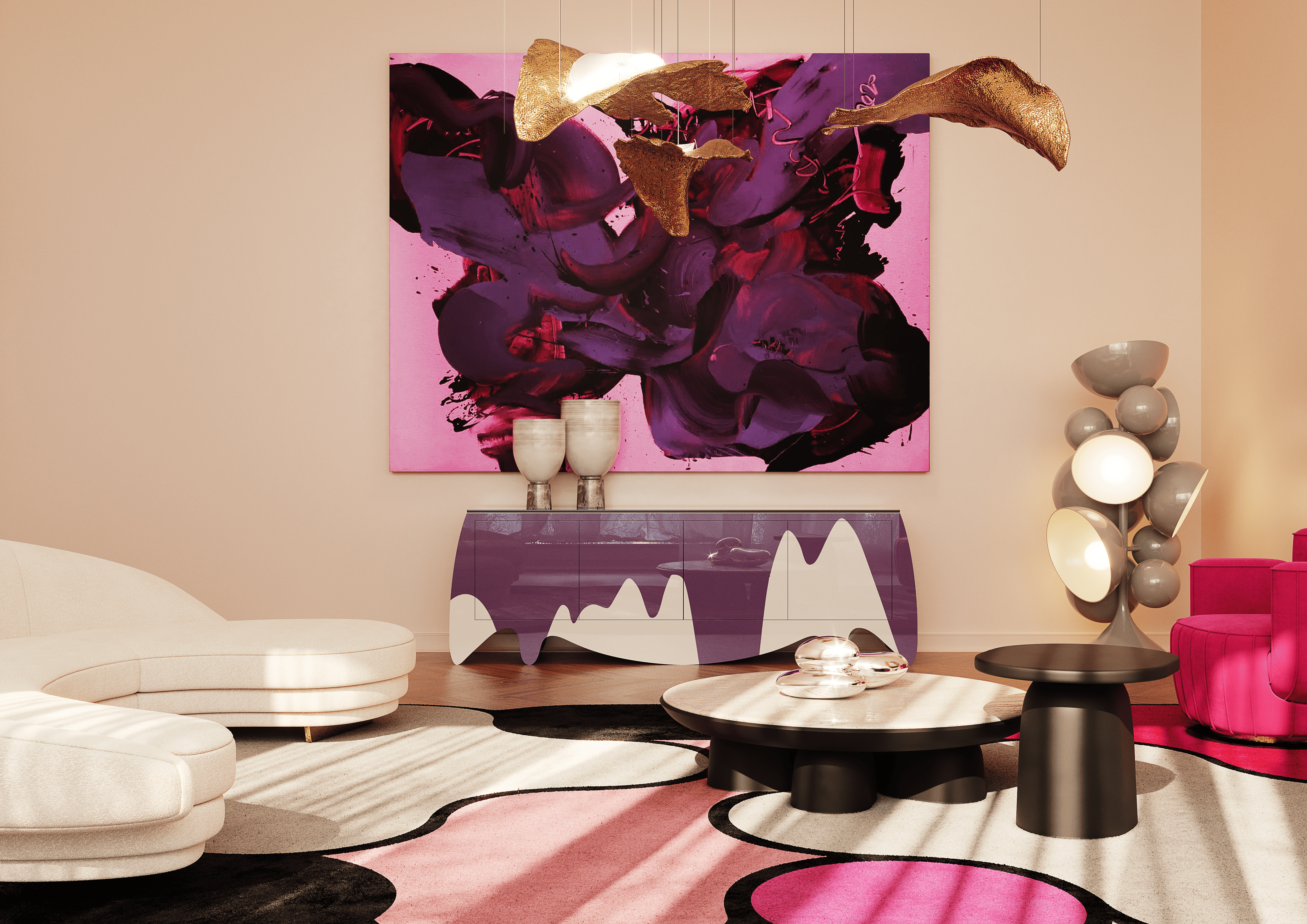
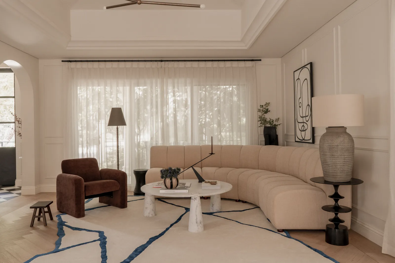
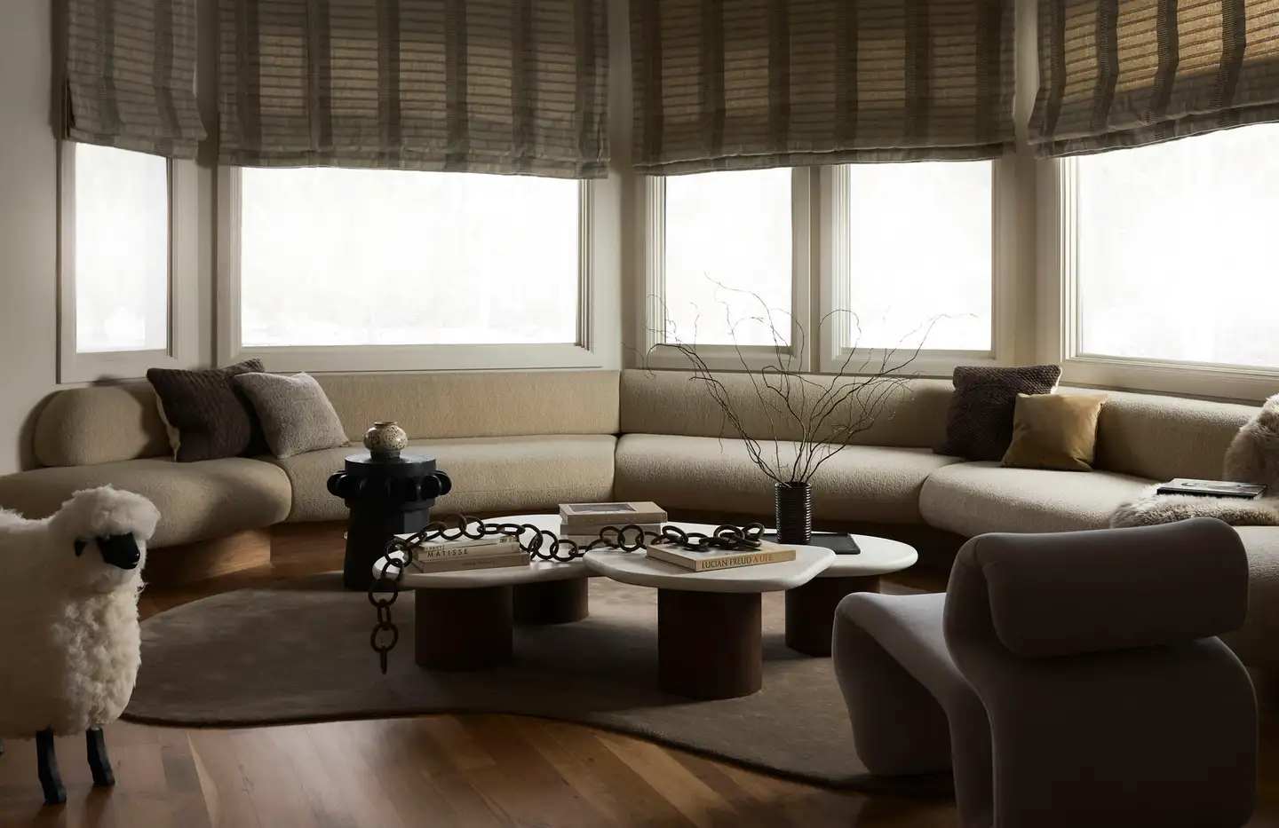
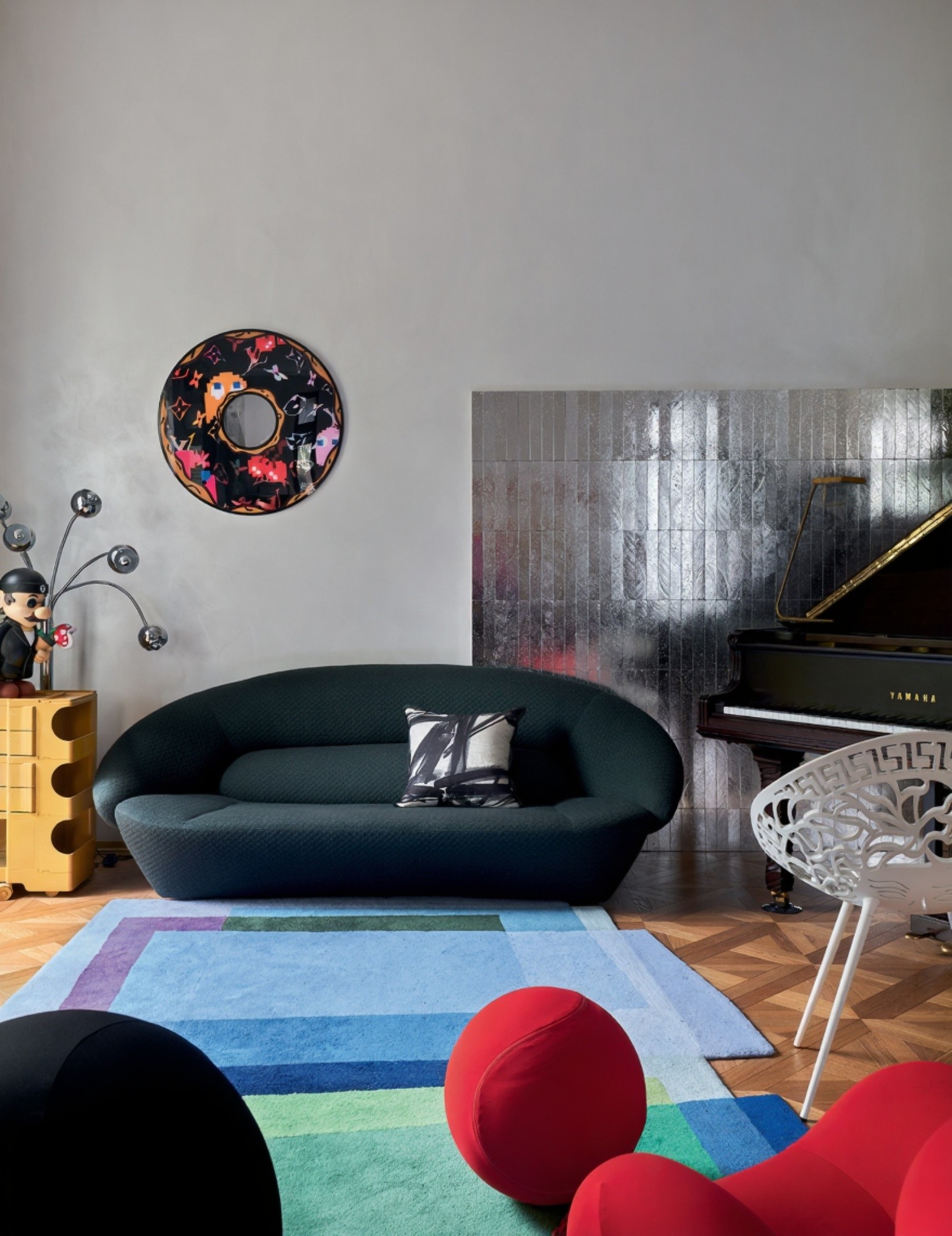
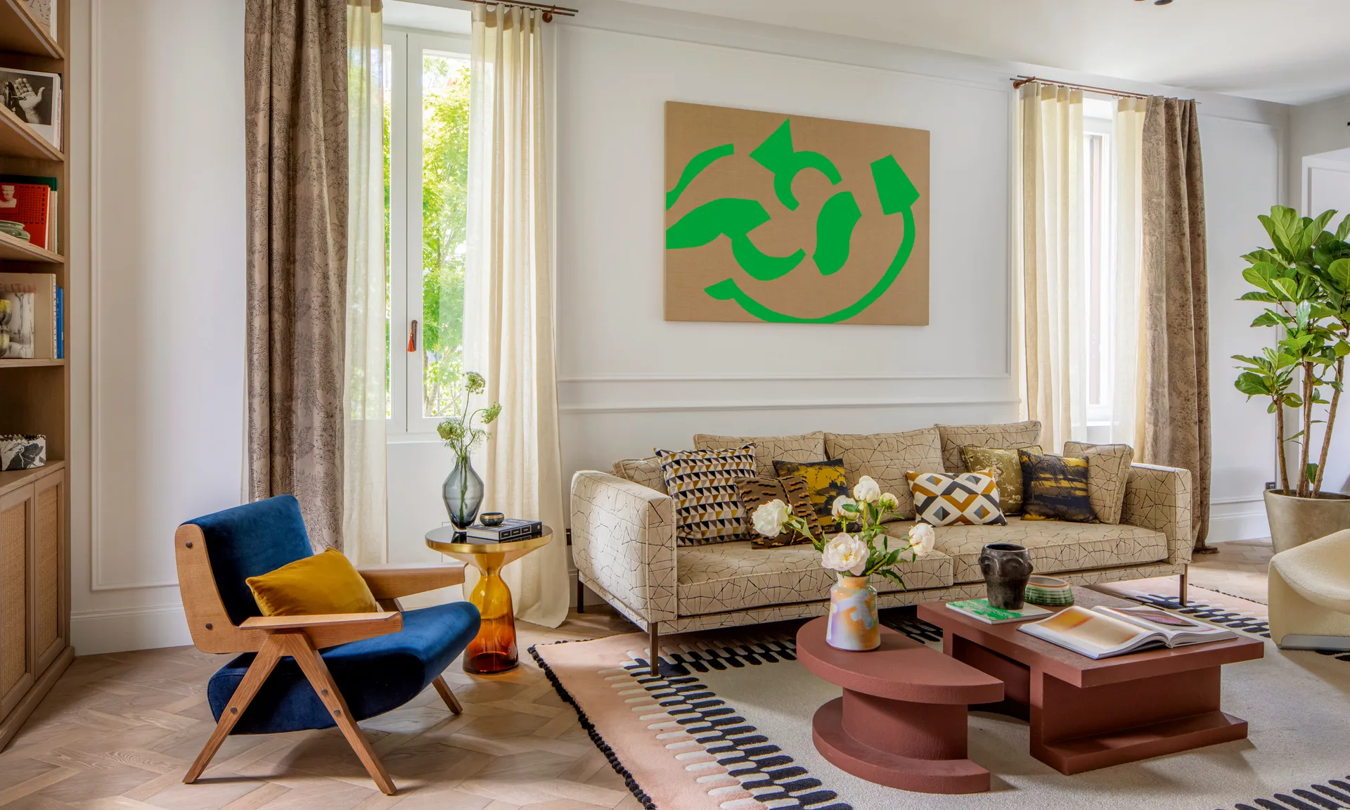
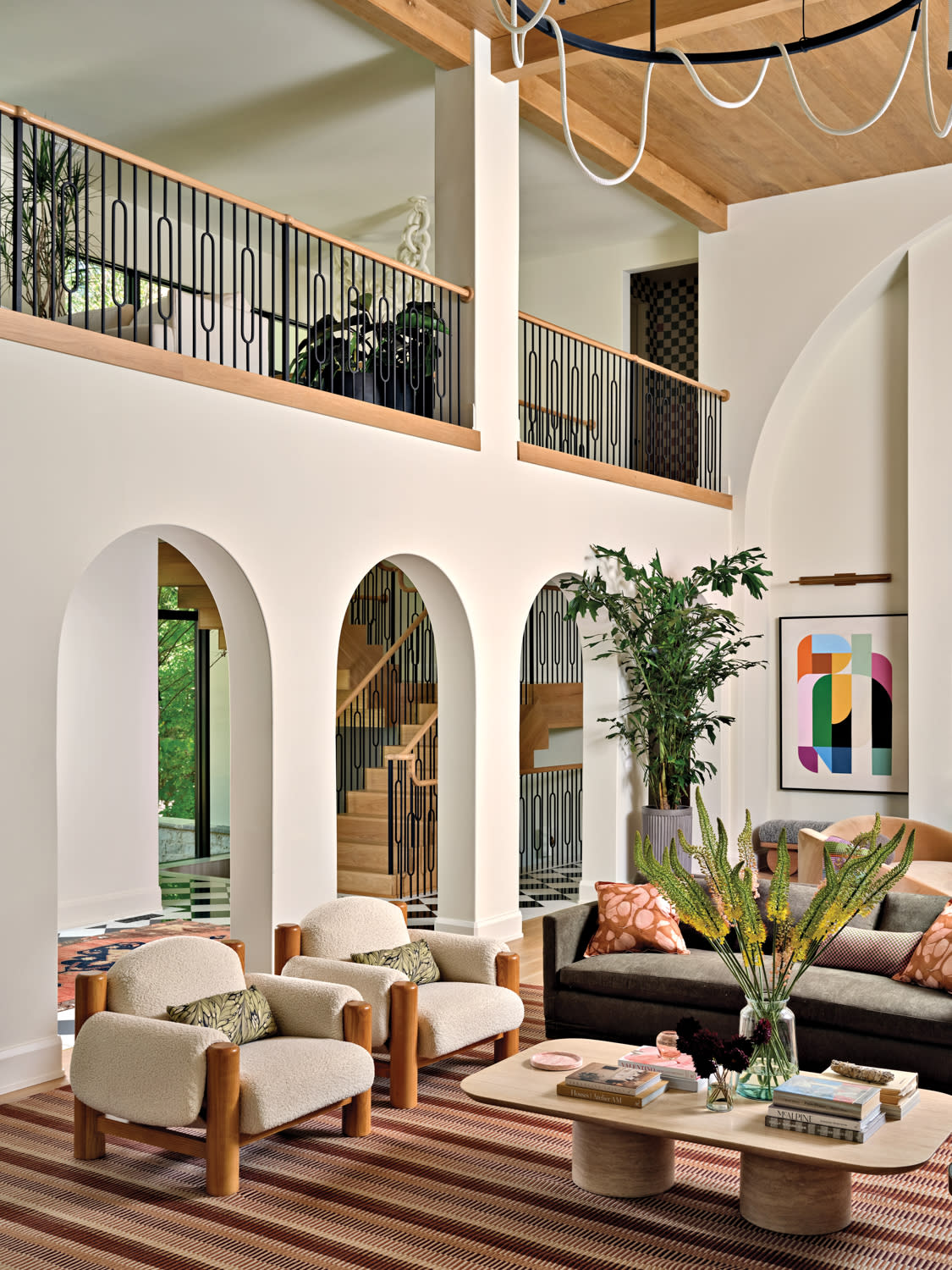
Enhance Interiors Through Custom Designed Rugs and Furniture In a modern home nestled in Atlanta’s Chastain Park, interior designer Jessica Davis composed a study in balance—between structure and softness, color and calm. The architecture’s strong geometry meets organic curves, natural finishes, and layers of light. Every space feels considered yet effortless, with custom designed rugs grounding each space in warmth and artistry. The palette is quiet but alive: greens, taupes, and soft blush tones flow through spaces of oak, plaster, and stone. Shapes repeat gently—arches, rounded furniture, curved ceilings—creating a rhythm that carries through the home. This project isn’t just about beauty; it’s about how texture, light, and craftsmanship can shape a place’s feeling. Kitchen: Warm Precision without Custom Designed Rugs The kitchen glows with sunlight that moves across white oak floors and cabinetry, bringing a natural rhythm to its clean-lined structure. A pair of double islands divides the room gracefully—one for work, one for gathering—creating balance between function and comfort. Texture defines space. Handmade tiles shimmer around the pizza oven, adding depth against the smooth oak and reeded glass. Light glances off every surface differently—matte wood, glossy tile, polished metal—turning a practical kitchen into a tactile, layered experience. The effect is both modern and timeless: refined design rooted in warmth and craftsmanship. Dining: Curves and Connection The dining area continues the home’s language of curves and craft. Two arched banquettes flank a long wooden table, turning the space into a social circle rather than a static layout. Their upholstery is neutral but textured, blending easily with the sculptural dining chairs in pale oak. The effect is a simple, warm, and welcoming space designed for easy gatherings, even without custom designed rugs on the floor. Soft light pours from above, catching on curved surfaces and illuminating every grain and weave. While there are no custom designed rugs here, the mix of materials—wood, fabric, and brushed brass—creates layers of texture and warmth. Gentle shadows trace the arches, emphasizing the play of form and proportion and keeping the space visually grounded. Living Area: Layers of Comfort The living area radiates a warm, inviting elegance, grounded by custom designed rugs that anchor the entire space with their earthy tones and subtle striped pattern. The rug’s rich layering of browns, reds, and neutrals enhances the room’s organic feel, echoing the natural wood beams above and the sculptural oak frames of the armchairs. Plush, textured fabrics on the seating—soft boucle for the armchairs and smooth upholstery for the sofa—invite comfort while maintaining a refined aesthetic. Complementing this tactile harmony, the furnishings embrace a modern yet timeless sensibility. The low-profile coffee table, crafted from pale wood, mirrors the tones of the custom designed rugs, reinforcing the palette’s warmth and subtle sophistication. Patterned throw pillows add visual rhythm and a touch of playfulness, while the greenery and abstract wall art introduce freshness and color. The Bar Lounge: Sculptural Warmth and Modern Play The bar area is a vibrant extension of the home’s modern organic decor, where geometry meets softness. A pair of curved velvet sofas embraces a sculptural white coffee table, their fluid forms echoed in the custom designed rugs that anchor the composition. The rug’s subtle linear texture and warm, earthy tones create a rhythmic backdrop beneath the furniture, softening the bold architecture and grounding the seating area in tactile comfort. Rich textiles — velvet, wool, and patterned pillows — layer warmth and personality, infusing the space with a sense of curated ease. The reflective surfaces and natural materials form a sophisticated interplay — metal and glass against velvet and wood — a conversation between refinement and relaxation. The result is a space that feels both inviting and artful, designed for gathering, lingering, and celebrating texture in every detail. Main Bedroom: A Cocoon of Calm The main bedroom feels like a retreat wrapped in soft color and light. Deep green walls and sheer draperies diffuse daylight into a tranquil haze. The curved headboard, upholstered in natural linen, follows the line of the wall, continuing the home’s devotion to organic form. The bed rests on custom designed rugs with a subtle check pattern; its gray and ivory tones ground the palette while adding a geometric rhythm beneath the softness. Furniture here feels sculpted yet understated. Pale wood nightstands and glass-shaded lamps offer a gentle glow at night. Across the room, a pair of low, 1970s-inspired chairs covered in boucle create a private nook. A small neutral rug defines the spot, providing a tactile layer under bare feet. Every surface—wood grain, velvet, plaster—absorbs light differently, building a quiet depth that invites rest. Secondary Bedroom: Color and Play The secondary bedroom introduces a playful shift in tone. Coral and saffron hues fill the space with energy, softened by daylight reflecting across the patterned walls. A four-poster bed in a warm orange tone becomes the centerpiece, its slim posts forming a gentle frame for the space. Around it, textures abound—woven cotton, smooth lacquer, and brushed oak—creating a lively yet cohesive mix. On the floor, custom designed rugs burst with color, blending coral, blush, and cream into a pixel-like pattern. It ties every accent together, from the canopy bed to the soft drapery. The room feels whimsical but refined—crafted to grow with its young occupant while maintaining the home’s artistic continuity. A Home That Breathes Throughout the home, light and texture are the true decorators. Surfaces shift from matte to gloss, fabric to stone, shadow to glow. Every room offers a study in contrast: hard and soft, bright and muted, modern and organic. Furniture curves, light bends, and color flows. In every corner, from the kitchen’s shimmer to the bedroom’s calm, beauty and comfort meet in perfect harmony. The custom designed rugs bring coherence to it all—softening hard materials, grounding each vignette, and adding an element of artistry beneath every step. They bridge furniture and architecture, blending the warmth of craft with the precision of design. For those looking to bring similar warmth and sophistication to their own spaces, TAPIS …