Sasha Adler Design Projects : The Beauty Of Mix Old And New
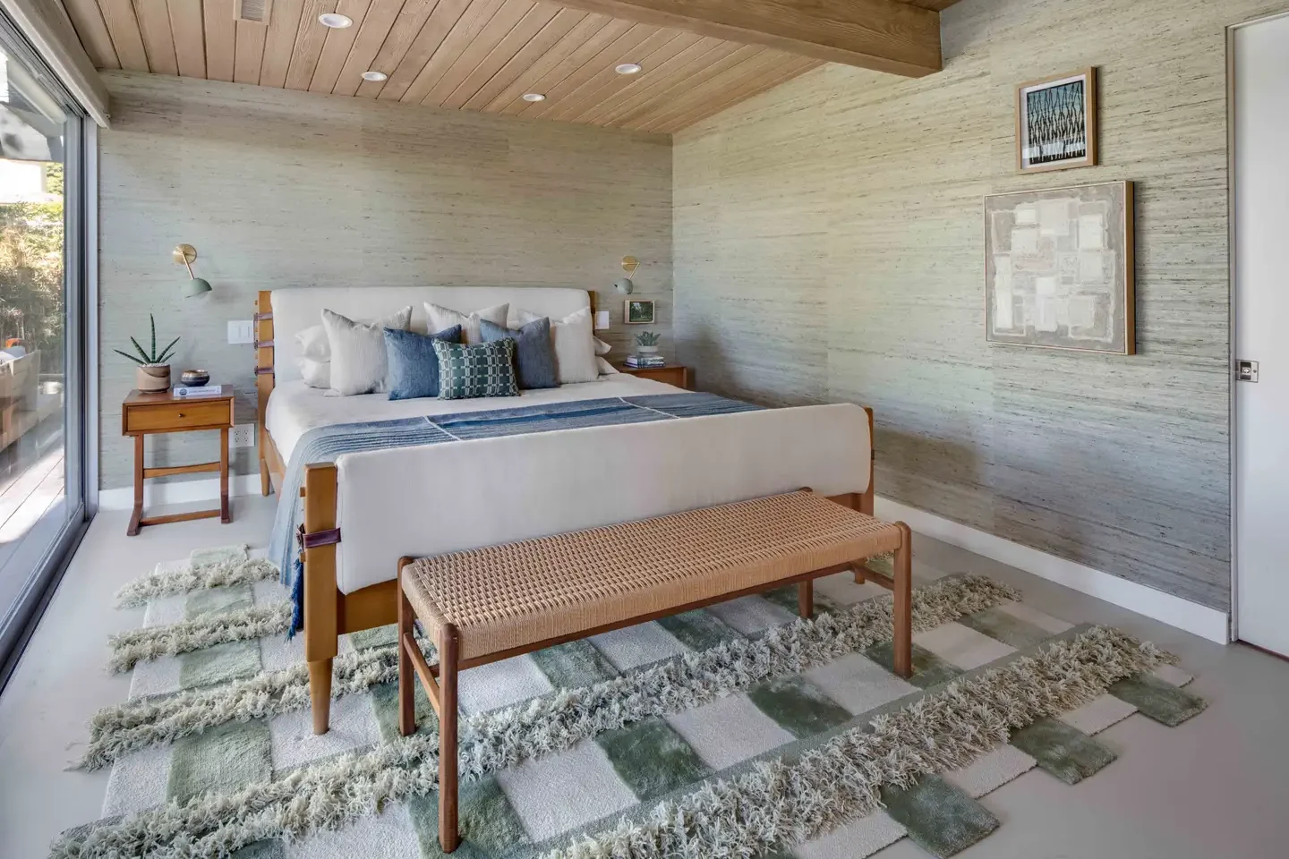
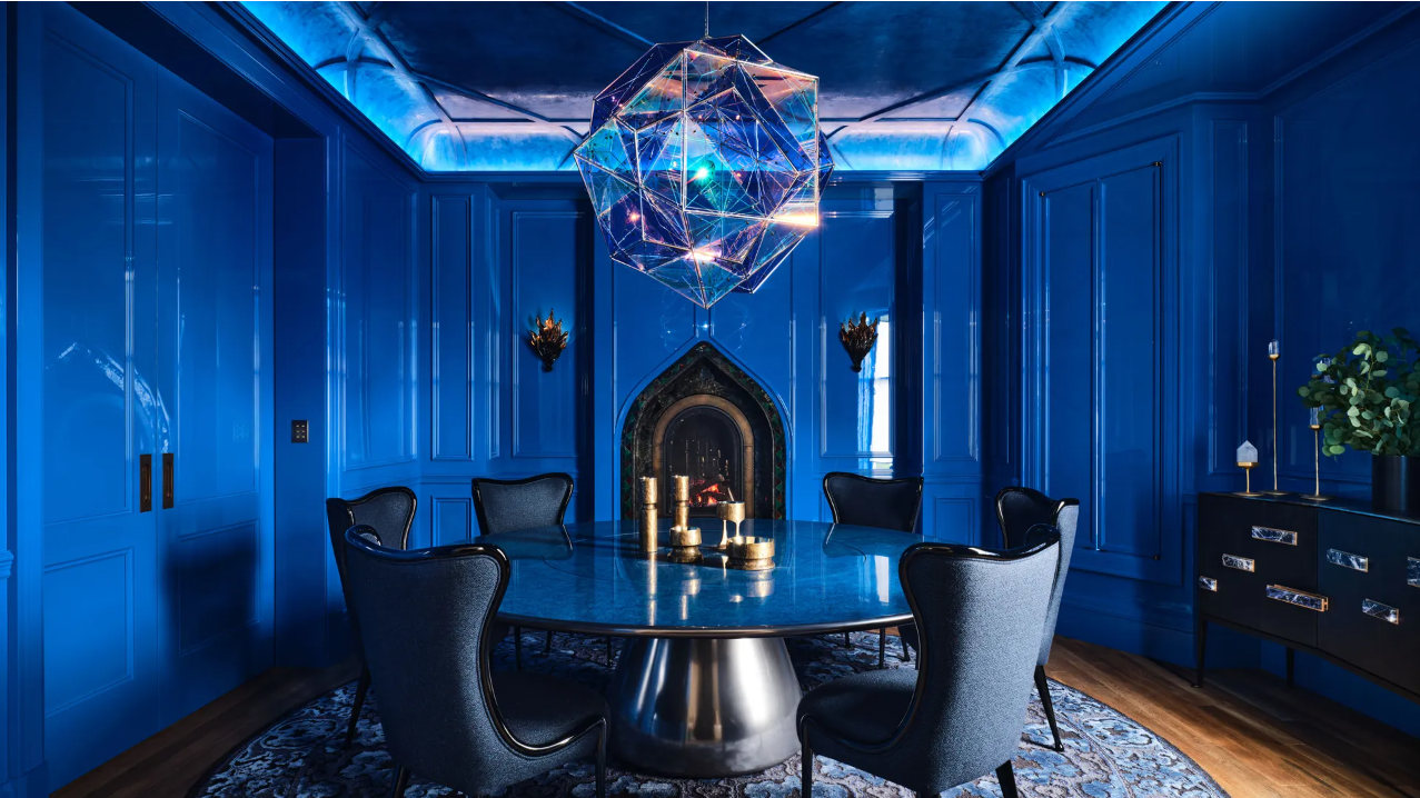
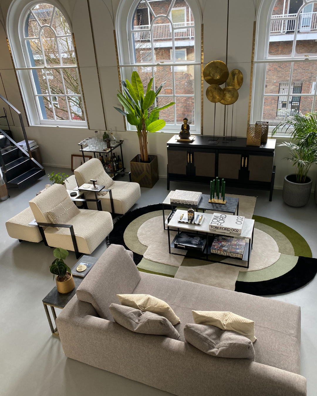
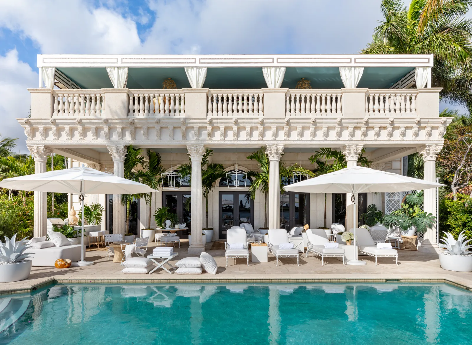
Let’s get to know Sasha Adler Design’s projects and understand how he works with the space’s architecture to create a balanced dialogue of modern elements, a collection of vintage pieces and custom design items. Sasha Adler Design is an interior design company specializing in restoring historic properties, but it also works on building from scratch. He is concerned with knowing his project, and that is how he commits himself to start a project. It treats the initial phase of each project as knowing the client and talking to him about how he would like the space to work. After obtaining this information, they build a narrative around the interior by carefully selecting architectural details, natural materials and custom designs. It agrees on its process to meet each client’s objectives, schedule and budget. In addition, he also focuses on creating a space that is attentive, comfortable and unique. Projects Let’s analyze some of Sasha Adler Design’s projects, in which we can understand how she works and expresses her inspirations in her works. We will be able to understand the old-fashioned style in his projects, in a combination of vintage pieces with a more contemporary atmosphere. Chicago Residence Let’s start in Chicago, in a residence on the near north side, where we have our first contact with the unique style of Sasha Adler Design. What comes first is the choice of colors used in this place, green being the choice in one of the prominent places in the house, the dining room. We can see the presence of green, even if in different tones, both on the wall and in some furniture items, such as the chairs. In the rest of the house, we see space where the designer prefers to keep the simplicity of white, in the living room and bedroom, or the boldness of other different colors, such as the intense blue, in another living room that this house presents. Considering what we mentioned earlier, Sasha Adler Design likes to play between the search for the archaic and the discovery of the modern. In this specific project, this game of styles is associated with finishing some decorative items and furniture pieces with older and more primitive lines. Combining all the styles worked on in this project, we also have an apex of maximalist tendency in this space. In some items, we have details of eccentricity and exaggeration, and we also have an overdose of details in the environment. Sasha Adler Design takes advantage of each location to add a point that brings something more to the environment. Combining all the styles worked on in this project, we also have an apex of maximalist tendency in this space. Chicago Family Home Let’s continue in Chicago and move on to a family home project. In this, several of the styles we explored earlier are present again, as we will see. However, it is a project with particularities about the previous one. Starting with the choice of colors, we have a color that dominates almost the entire house, blue. Color dominates nearly all spaces, from the living room to the bathroom. Only in some divisions the color blue is absent, and it is another color that takes over the place, as is the example of the office, in tons of wood, and the dining room, in tons of white. In this project, we see again the intention to use old-fashioned items. We can see this very present in decorative items, such as the bathroom, which has a mirror and a faucet with rustic finishes. We can also see lamps throughout the house that refer to this antique style. However, we were able to perceive the contrast that Sasha Adler Design works between the old vs the modern, with elements that refer to this contemporary style. We can see this in some spaces of this project where a minimalist style can be identified, with the absence of exaggerated details. In this game of styles, despite the contrast, the designer still manages to bring harmony and make this space pleasant and charming. Even so, all this minimalist tendency that we can find in some spaces is not the main style of this project. As seen earlier in the Sasha Adler Design project, maximalism is worked on in practically all environments. The concern to convey meanings to the house’s rooms is very present, from the presence of bolder wallpaper or more eccentric pieces of furniture or decoration. Little throughout the place, we can see the use of all the space to create an essence around the area. Beverly Hills Let’s move now to the last project that we will analyze from Sasha Adler Design, located in Beverly Hills. In this one, we will see a project very different from the other two that we presented earlier, in which the archaic aspect is set aside, and the presence of these old-fashioned elements is not found in the environment. In this project, the contemporary style is very present throughout the space. Open, simple areas, lots of natural light, and large windows, these are some of the main features that stand out at first glance when looking at this project by Sasha Adler Design. Serene and calming colors are in the essence of this place, with the white and brown of the wood as the basis of the environment. The designer tries not to explore too many different colors, only colors other than those mentioned are present in some decoration details, such as rugs. In addition to all the features listed above, the modern style extends even further to the minimalist trend in this project by Sasha Adler Design. We can see spaces where the elements are linear and harmonious with the rest of the area in the environment, these elements being little responsible for carrying meaning to these same places. The exterior location is a perfect example of this, where we can see that the designer’s concern was to display tranquility and well-being without excessive elements. We …